

Showing posts with label typography. Show all posts
Showing posts with label typography. Show all posts
Tuesday, September 4
ON THE HORIZON...

Tuesday, August 28
VALERIE & KEVIN'S FARM TO TABLE WEDDING
Last year we created wedding invites for one of our fave contestants on Top Chef, Kevin Gillespie and his lovely fiance Valerie. Kevin owns a restaurant in Atlanta called Woodfire Grill and he wanted the invites to evoke the same farm to table attitude that his restaurant does. The wedding was featured in Atlanta Weddings magazine. Here is a photo that their photographer, Something Pretty, took of the feature as well as some detail photos of the invite shot by us.


image above via Something Pretty


Thursday, August 23
SARAH & KEVIN'S EMPIRE STATE SOUTH WEDDING
One of our recent custom invite design clients, Sarah & Kevin are featured today on Style Me Pretty. So head over there and check out their beautiful wedding held at Empire State South (Hugh Acheson anyone??!! we are Top Chef Master geeks over here...)

Photo by Our Labor Of Love
Friday, February 17
LISTENIN' AND LOVIN': THE FRAY SCARS & STORIES

Currently playing in the studio today. From the album cover design to the slab serif fonts to the music, it's worth the listen.
Wednesday, February 8
HUNGER GAMES LOVES TYPOGRAPHY

We spotted this marketing material that's being used to promote the upcoming Hunger Games film. How freakin' cool is this? We loved the books and are eagerly awaiting the movie, and seeing this makes it all the more exciting!
Wednesday, January 18
NEW TO THE SHOP: THE GENTLEMAN RULES PRINT


Hey y'all! Introducing a new print to the shop; The Gentleman Rules print. Everyone needs a reminder from time-to-time. Stop by and pick one up!
Thursday, August 4
SNEAK PEEK


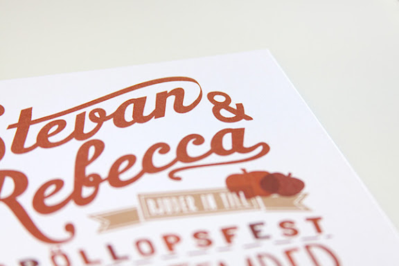
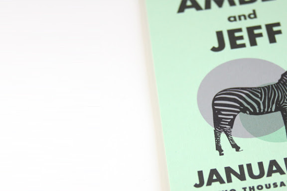


We've been super-duper busy for the past few months and have shown nearly none of our work! That's all about to change. In the next few weeks, we are getting one of our great photographer friends, Geoff Wood, to help us photograph our portfolio to have it ready for your viewing pleasure! Until then, we wanted to give you a sneak peak of a view of the many invites we have been working on lately!
Tuesday, February 23
GOOD TYPOGRAPHY IS INVISIBLE


While creating this blog, I made my way over to Google images to find a few images to use in test posts. I'm a typography geek, so my first search query was just that (minus the geek part). I saw the "Good Typography is Invisible, Bad Typography is Everywhere" image (top left) and it blew my mind. And I knew once we got the blog up and running, I would post about this and find out more about the person behind such works.
This person is Craig Ward, an Art Director and Senior Designer in New York that is seasoned in his craft. I looked through his work and wanted to pull everything to post, but picked a few favorites to show here. He does such a flawless job using type as an art form and really gives it meaning and a feeling that takes true skills to achieve.
I believe type is one of the most important elements in a design, and I think he probably feels the same way. I think a a lot of designers (myself included) gravitate to great photographs or illustrations to make up for the lack for great typography. But don't get me wrong, there are always times when typography should take a back seat to other elements in design, and good designers know when are where to make that happen. But even in those times, good typography is equally as important to make the entire piece come together.
Subscribe to:
Posts (Atom)